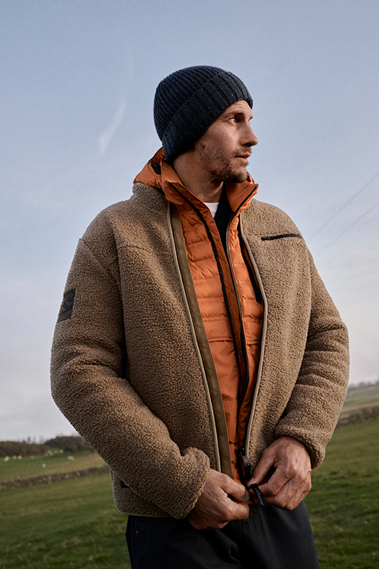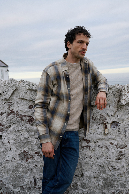
Contrasts are making a striking impression this season. The word stems from the Latin *contra* (against) and *stare* (to stand)—two visual opposites facing one another. Why does this create visual tension? Because sight is our dominant sense. Intense color combinations and contrasting textures can trigger a dopamine rush, boosting positive emotions and motivation. The result is a look that radiates energy without being loud.
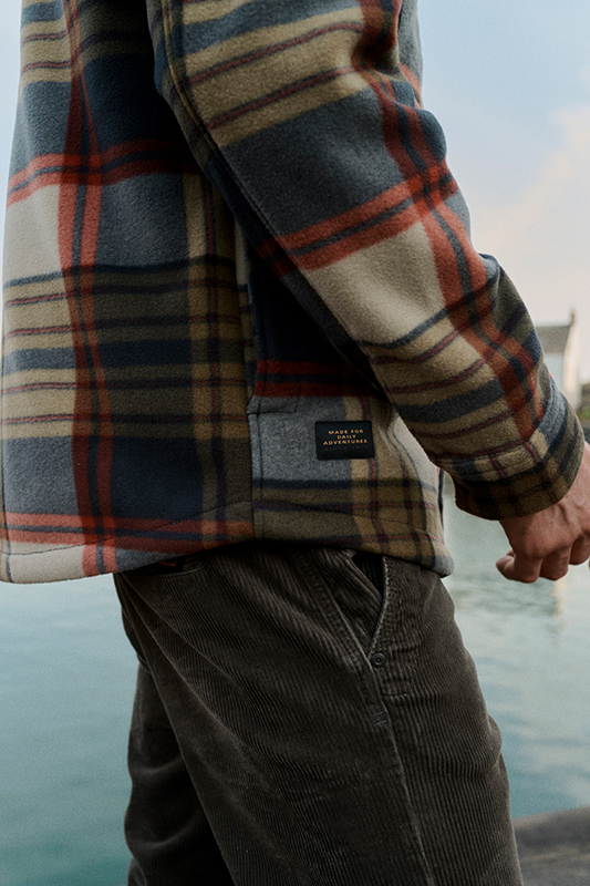
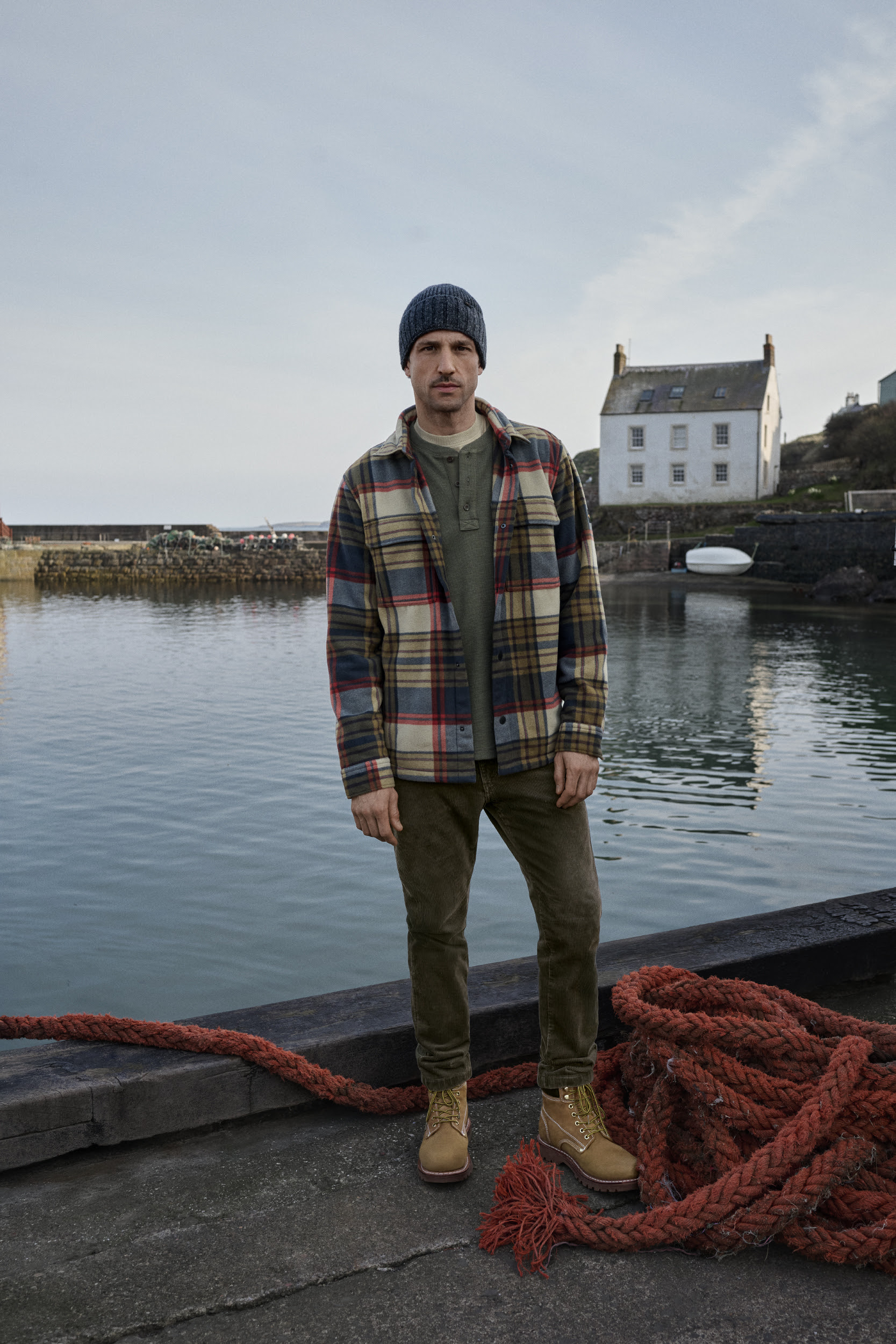
In menswear, the contrasts for Autumn/Winter 2026 are played out through a mix of check and tribal patterns combined with various color schemes. The highlight piece is the blue, yellow, and green checked overshirt. This creates contrasts that do not clash but instead come together to form a vibrant, cohesive look.